
Published by Nexcey Editorial Team · Researched & Fact-Checked · Editorial Standards.
A brand identity should help you make everyday decisions. It should tell you how a proposal, website and customer email can belong to the same business. A logo is part of that, but so are the words you choose, the information you emphasize and the way you present evidence. Start with the work the identity needs to support.
Begin with business strategy
Clarify the offer, revenue model, growth priorities, geography, and competitive context. Identity should support the business the company is becoming, not decorate an outdated description of it.
Define the priority audience
Describe the customer’s situation, goals, anxieties, alternatives, and decision criteria. Avoid broad labels such as everyone or small businesses when different groups value different things. Avoid mistaking a single graphic asset for an entire brand system by reading our breakdown of logo vs brand identity.
Write a positioning statement
State who the brand serves, the category it competes in, the value it provides, and the credible reason to choose it. This internal statement guides decisions; it does not need to appear word for word in marketing.
Choose brand attributes
Select three to five traits that shape behavior and expression, such as direct, optimistic, rigorous, warm, or inventive. Define what each trait means and what it does not mean.
Create a message hierarchy
Develop a core promise, supporting benefits, reasons to believe, short description, elevator version, and audience-specific messages. Connect capabilities to customer outcomes without unsupported claims.
Develop the visual identity
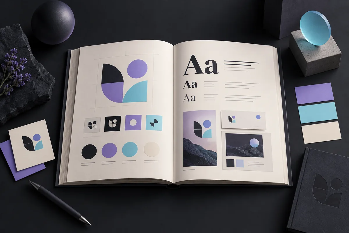
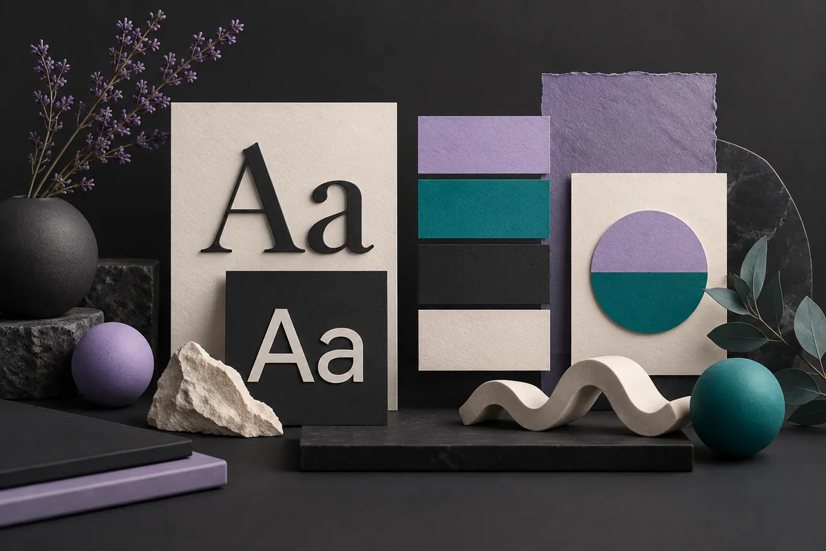
Create a responsive logo system, accessible color palette, practical typography, imagery direction, icon approach, layout principles, and motion guidance where needed. Test the system in real applications, not only a presentation. Lock in brand consistency across digital and print collateral with our guide on how to create a brand style guide.
Define the voice
Document tone, sentence style, vocabulary, preferred terms, and examples. The voice should remain recognizable while tone adapts to sales, support, errors, celebrations, and legal information.
Apply it to priority touchpoints
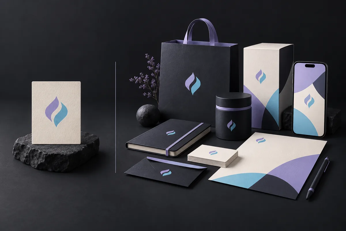
Test the identity on the website, proposal, social profile, email, invoice, packaging, signage, or product interface. Fix weaknesses before producing a large asset library.
Protect consistency without freezing growth
Create templates, shared assets, owners, and a review process. Record exceptions and evolve the system when evidence shows that customers or operations need something different.
Practical checklist
- Business goals and audience defined
- Positioning statement approved
- Three to five brand attributes explained
- Core message hierarchy written
- Logo variations and minimum sizes documented
- Accessible color and typography system tested
- Voice principles include examples
- Priority touchpoints prototyped
- Asset ownership and governance assigned
Frequently asked questions
Is a logo the same as a brand identity?
No. The logo is one identifier inside a broader system of strategy, language, visuals, and behavior.
How much identity does a new business need?
Enough to launch consistently: positioning, core messages, logo variants, color, typography, basic imagery, voice, and templates for priority channels.
Can a small business change its identity later?
Yes. Build a sound foundation, then evolve it as the offer, audience, evidence, and market change.
Should a brand follow design trends?
Use trends only when they reinforce the intended character and remain practical. Recognition and fit matter more than appearing fashionable.
Take the next step
Build a distinctive brand identity with Nexcey.
Sources & further reading
Choose attributes you can actually apply
“Professional” is too broad unless you explain what it means in practice. It might mean clear scope, restrained layouts and specific language. “Friendly” might mean helpful instructions and an approachable tone, not informal jokes in every message. Write a good example and a counterexample for each attribute.
Then test those decisions on the three touchpoints you use most. A small business may learn more from a homepage, quotation and email signature than from a large presentation of unused applications. Refine the rules where they fail. Consistency should reduce repeated decisions, while still allowing a support message to sound different from a product announcement.
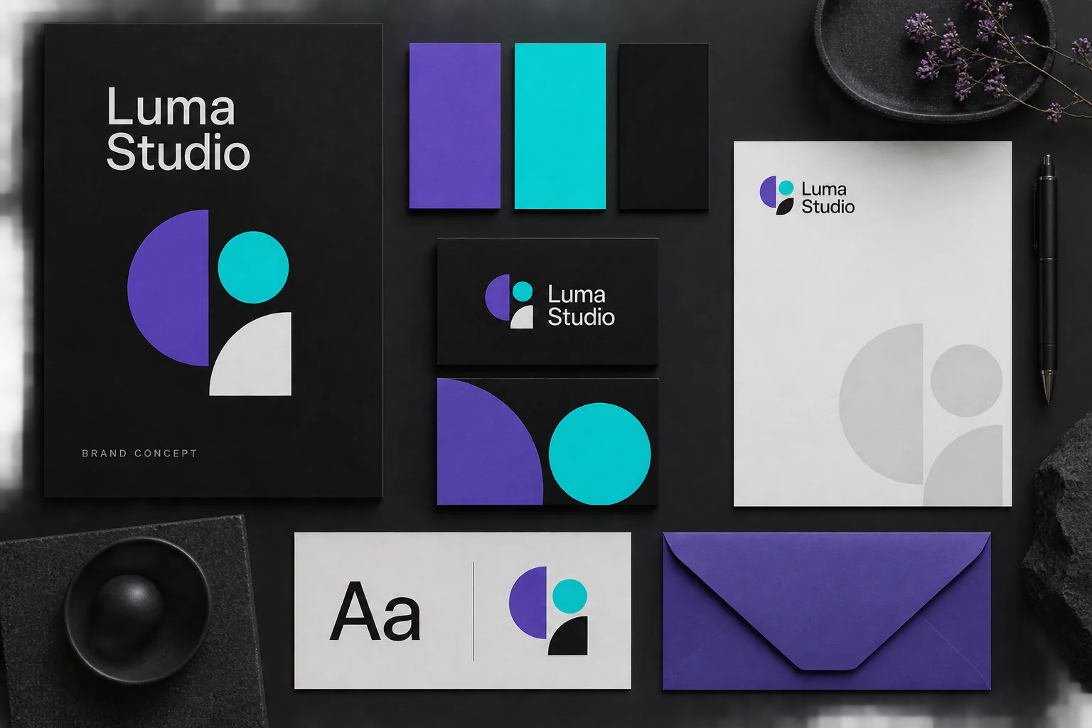
A lean identity for a fictional design studio
Luma Studio is an invented teaching example, not a Nexcey client. Its brief is to appear clear, capable and approachable. A small set of roles is enough to begin: one readable type family, a dark neutral, restrained purple and cyan accents, and a direct writing style.
| Decision | Rule to test |
|---|---|
| Voice | Explain the deliverable before using a slogan |
| Typography | One family with distinct heading and body sizes |
| Colour | Neutrals for reading; accents for emphasis |
| Applications | Test a proposal, homepage and email signature |
| Evidence | Use real project material only with permission |
Continue with a related guide
- How to Create a Brand Style Guide for Your Business
- How to Plan a Business Website: The Complete Guide from Idea to Launch